Today I found another way to draw the Sierpinski triangle using pure CSS. There are no recursive divs corresponding to the fractal structure, so it's simpler and performs better.
The method is to use multiple background gradients to draw triangles that are controlled by background-size.
Here is how
Actually, the whole code is pretty simple, but I'll try to explain it step by step.
Step 1
Let's add a linear-gradient tilted with a degree to make it a triangle.
div {
  width: 160px; height: 160px;
  --lg: linear-gradient(135deg, #000 50%, transparent 0);
  background: var(--lg) 0 0 / 100% 100%;
  background-color: #f5f5f5;
}
Step 2
Add another one with background-size of 50% 50%.
div {
  width: 160px; height: 160px;
  --lg: linear-gradient(135deg, #000 50%, transparent 0);
  background:
    var(--lg) 0 0 / 100% 100%,
    var(--lg) 0 0 / 50% 50%;
  background-color: #f5f5f5;
}
The previous background has a higher z-index value than the latter one when there are multiple backgrounds. And that's what we wanted: using smaller triangles to fill the holes.
Step 3
Then add enough levels of gradients. The background-size
is always half the size of the previous one.
div {
  width: 160px; height: 160px;
  --lg: linear-gradient(135deg, #000 50%, transparent 0);
  background:
    var(--lg) 0 0 / 100% 100%,
    var(--lg) 0 0 / 50% 50%,
    var(--lg) 0 0 / 25% 25%,
    var(--lg) 0 0 / 12.5% 12.5%,
    var(--lg) 0 0 / 6.25% 6.25%;
  background-color: #f5f5f5;
}
Step 4
Swap background and gradients (triangles) colors.
div {
  width: 160px; height: 160px;
  --lg: linear-gradient(135deg, #f5f5f5 50%, transparent 0);
  background: /* ... */;
  background-color: #000;
}
Final step
Remove the top left part with mask and adjust angle with transform.
See also the live example on CodePen.
div {
  width: 160px; height: 160px;
  --lg: linear-gradient(135deg, #fff 50%, transparent 0);
  background:
    var(--lg) 0 0 / 100% 100%,
    var(--lg) 0 0 / 50% 50%,
    var(--lg) 0 0 / 25% 25%,
    var(--lg) 0 0 / 12.5% 12.5%,
    var(--lg) 0 0 / 6.25% 6.25%;
  background-color: #000;
  mask: linear-gradient(-45deg, #000 50%, transparent 0);
  transform: skew(26.5deg) translateX(-25%);
}
How deep it can go
Chrome can render as many triangles as possible but Safari and Firefox don't work well as the triangle is getting smaller.
(I later realized it's caused by the subpixel problem.
So I set the dimension to be 160px, which's divisble by exponential values of 2.)
Hmmm
CSS is kind of different from any other tools. Sometimes you really need to think in CSS in order to develop an elegant solution.
The technique described in this article can be used to generate many interesting patterns too,
together with radial-gradient or conic-gradient.
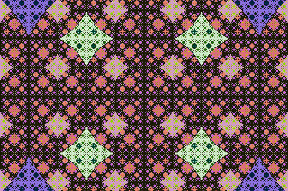
That would be another journey.