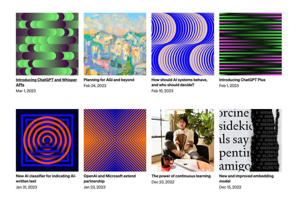
While most people are interested in ChatGPT and other products from the OpenAI company, I find myself intrigued by the generative cover images that accompanied with their blog posts and research articles. I don't know the tools they use but I love the style of the designers.
I've tried to recreate some of them with css-doodle. The process was a lot of fun, like solving puzzles, excitement comes with finishing each one.
This CodePen link contains all the editable demos. Please note that the demos on this page and on CodePen are best viewed in Google Chrome.
#1
I started with the cover image from this blog post a couple of weeks ago.
(Safari still does not support the data URI format for SVG filters, so the grainy noise texture will not display if you're browsing with iPhone.)
@grid: 1x21 / 400px / #091608;
@gap: calc(50%/@I);

background-blend-mode: multiply;
background-size: 110% 100%;
background-image:
  @doodle(
    background: #fff;
    filter: @svg-filter(.8);
    opacity: .6;
  ),
  linear-gradient(
    90deg,
    @p(#14ff2e, #f452ea) @rn(±100%, 5, 2),
    #000, @P
  );
#2
From this blog post. Something is still missing in details but the similiarity is getting close. I can't go further without any manual adjustment though.
@grid: 1x8 / 400px / #400140;
--offset: @rn(1%, 8%, 2, 2);

rotate: @pn.mirror.m2(180deg, 0);
background-color: @pn(#4c3b4b, #586954);
background-image: @doodle(
  @grid: @p(4, 5)x1 / 100% ~ @p(--offset);
  @size: 50% 100%;
  border-radius: 100px;
  box-shadow: -1em 0 .5em #40024011,
    1em 0 .5em #72ec6d11;
  position: absolute;
  translate: calc(@i(-1) * @r(16%, 18%));
  background: linear-gradient(
    to @pn(right, left, @m5(right)),
    #72ec6d, #40063f
  );
);
#3
From this research article. It might be the easiest one since css-doodle is good at building grids.
@grid: 24 / 400px / #e5f1ff;
@size: 100% calc(100%/@Y*@y);

background: #a0522d;
rotate: @rn(0, 360deg, .8);
margin: auto;
#4
From this research article.
@grid: 24 / 400px / #2D712B;
@size: 100% calc(100%/@Y*@y);

background: #fee6ff;
margin: auto;
rotate: calc(90deg - @dy/@dx * 45deg);

@match(
  (x >= y && x <= (Y-y+1)) ||
  (x <= y && x >= (Y-y+1))
) {
  rotate: calc(@dx/@dy * 45deg);
}
I have found several other interesting results while working on this pattern. There must be more.
@grid: 24 / 240px / #2d712b + .95;
@size: 100% 4px;

background: #fee6ff;
margin: auto;

rotate: calc(
  @round.pow(@dx/@dy, .1) * 90deg
);@grid: 20 / 240px / #2d712b + .95;
@size: 100% 3px;
background: #fee6ff;
border-radius: 50px;
margin: auto;
rotate: calc(@dx * @dy * 60deg);Adding hues.
@grid: 24 / 240px / #4d49af +.95;
@size: 100% 2px;

--n: @round(@dy/@dx + @dx/@dy);

margin: auto;
rotate: calc(var(--n) * 60deg);
background: hsl(
  calc(var(--n) * 36), 80%, 80%
);
#5
From this blog post.
@grid: 1x2 / 400px / #e8c7b6;
rotate: @pn(180deg, none);
background-size: 100% 100%;
background-image: @doodle400x200(
  @grid: 39x1 / 150% 100%;
  @size: auto 100% 1;
  border-radius: 50%;
  translate: -70%;
  box-shadow: inset
    calc(@i(%13) * 1.2px) 0 0 #0800fd;
);
#6
From this research article. The cover image has been clipped in the article, the full image can be found in middle of its overview page.
It's probably the most complex one.
:doodle {
  @grid: 1 / 400px / #50da4e;
  background-image: @doodle(
    @grid: 1x27 / 100% +.9;
    @gap: calc(60%/@I);
    background: linear-gradient(-90deg, #fff, #fff0 75%);
  );
}

background:
  @doodle(
    filter: @svg-filter(.8);
    opacity: .6;
    mask: linear-gradient(-90deg, #fff0, #fff);
  ),
  linear-gradient(90deg, @m2(#fff), 30%, @m5(#000));

mask-size: 100% 100%;
mask-image: @shaders(
  texture_0 {
    @grid: 1x27 / 100% +.9;
    @gap: calc(60%/@I);
    background: linear-gradient(-90deg, @m2(#fff), #fff0);
  }
  fragment {
    void main() {
      vec2 ur = u_resolution;
      vec2 c = vec2(.5, .5);
      vec2 p = gl_FragCoord.xy / ur.xy - c;
      float r = length(p);
      float len = length(p * vec2(ur.x / ur.y, 1.));
      float t = atan(p.y, p.x)
        + 1.57 * smoothstep(.4, 0., len);
      vec2 coords = c + vec2(r*cos(t), r*sin(t));
      FragColor = texture(texture_0, coords);
    }
  }
);
#7
From this blog post.
@grid: 2x1 / 400px / #fe7600;
rotate: @pn(0, .5turn);
@content: @Svg(
  viewBox: 0 -13 26 26;
  fill: none;
  stroke: #0205ad;
  rect*24 {
    transform: rotate(45);
    stroke-width: @n(*.062);
    width, height: @n(*3);
    x, y: -@n(*1.5);
  }
);
#8
From this blog post. Similar to previous image, with different colors and directions.
@grid: 2x1 / 400px / #7bf07a;
rotate: @pn(0, .5turn);
@content: @Svg(
  viewBox: 0 -13 26 26;
  fill: none;
  stroke: #8a2be2;
  rect*24 {
    transform: rotate(45) translate(18.5, -18.5);
    stroke-width: @n(*.062);
    width, height: @n(*3);
    x, y: -@n(*1.5);
  }
);
#9
From this blog post.
@grid: 1 / 400px / #ffe0db;
@content: @Svg(
  viewBox: 0 0 45 45 padding -12.5;
  fill: none;
  stroke: #0800fe;
  path*45 {
    stroke-width: @abs(.5 - 1/@N*@n);
    d: M 10 @n
       Q 22.5 @calc(@n + (45 - @n*2)/1.85)
         35 @n
  }
);
#10
From this blog post.
@grid: 1x2 / 400px / #343321;
rotate: @pn(0, 180deg);
background: @doodle400(
  @grid: 25x1;
  background: #e5f1ff;
  width: calc(100% - 100%/@I1*@i);
) 0/100%;
#11
From this research article. Click the image to make it animatable.
@grid: 20x1 / 400px / #38004C ~ -20% 20%;
@place: center;
@size: calc(40px * @i - 16px);

z-index: @I(-@i);
rotate: @r(360deg);
border: 4px solid #090C27;
border-radius: 50%;
background: conic-gradient(
  #f91c8e, #f4947e, #d6d348,
  #aea6e8, #38004c, #38004c
);

:after {
  content: '';
  position: absolute;
  top: 0;
  @size: 16px;
  border-radius: 50%;
  background: radial-gradient(
    farthest-side at 20% 20%,
    #fff, #f9208e
  );
}

@nth(1) {
  background: #090c27;
  :after { content: none }
}
#12
From this blog post.
@grid: 1 / 400px / #000 +3;
background-size: 100% 100%;
background-image:
  @doodle400(
    @grid: 50x1;
    @place: center;
    @size: 50%;
    border: 6px solid #0ff;
    transform:
      rotateY(calc(176deg/@I*@dx));
  ),
  @doodle400(
    @grid: 1x50;
    @place: center;
    @size: 50%;
    border: 6px solid #0ff;
    transform:
      rotateX(calc(176deg/@I*@dy));
  );
#13
From this blog post.
The challenging part is obtaining the precise colors prior to applying the mix-blend-mode effect.
@grid: 6x1 / 400px / #ffe7c2;
@place: @pn(@m4(center), 50% 0, 50% 100%);
@size: @pn(100%, 74%, 52%, 30%, 100%, 100%);
border-radius: 50%;
mix-blend-mode: @pn(@m4(unset), @m2(difference));
background: @pn(
  linear-gradient(-90deg, #fee754, #ffe7a7),
  linear-gradient(145deg, #0a1293 10%, #fff0 85%),
  linear-gradient(100deg, #ab0a7b, #fff0 85%),
  radial-gradient(circle at 30% 70%, #53b42d 18%, #fff0 80%),
  linear-gradient(90deg, #e44100, #fff0),
  linear-gradient(-90deg, #e44100, #fff0)
);
#14
From this blog post.
@grid: 1 / 400px;
@content: @svg(
  viewBox: 0 0 5 5 p .3;
  style background: #013131;
  defs g#rect rect*0-4 {
    x, y: @n(/9) @n(/-9);
    width, height: .55;
    stroke-width: .035;
    fill: #013131;
  }
  use*5x5 {
    href: #rect;
    transform: translate(@nx(-1), @ny(-.55));
    stroke: #006c6c;
  }
  use*5 {
    href: #rect;
    transform: translate(@pn([12413]), @n(-.55));
    stroke: #ffc98a;
  }
);
#15
The footer image in every page.
--c: #0900fe;

:doodle {
  @grid: 1x22 / 100% auto 0;
  border-bottom: 107px solid var(--c)
}

height: calc(1px * @i);
margin-bottom: 1px;
background: var(--c);