Lately I had some fun with Unicode in CSS and made several interesting background patterns with them. There's one on CodePen.
I haven't fully explored the whole Unicode table yet but I'd like to share some methods which are used to build those patterns. Hope this brings you some inspirations for web design.
The way to use in CSS
Unicode characters can easily be added to the pseudo-elements, :before and :after,
in the content property. The following code displays the arrow '→'.
.element:after {
  /* The number after slash '\' is in hexadecimal format. */
  content: "\2192";
}
Tiling
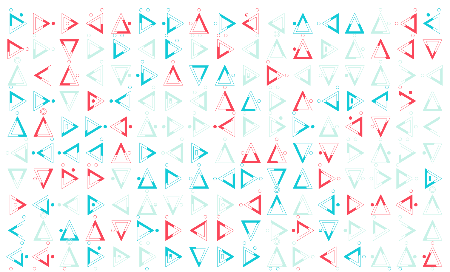
A single character may not look anything special unless there are many of them being put together. One of the most common ways to do this is to put them into a grid.
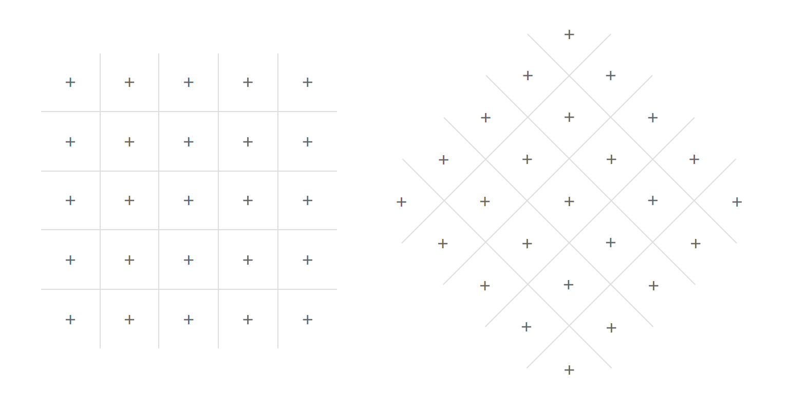
The result looks appealing most of the time after applying some random rotations and color palettes to the grid content.
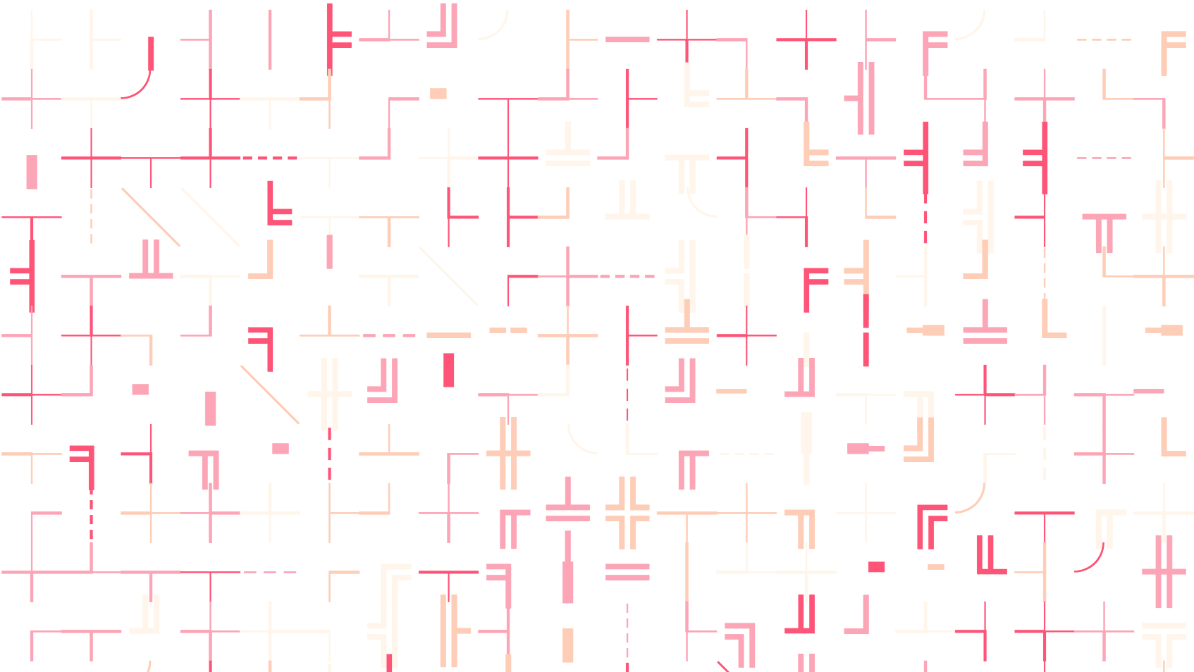
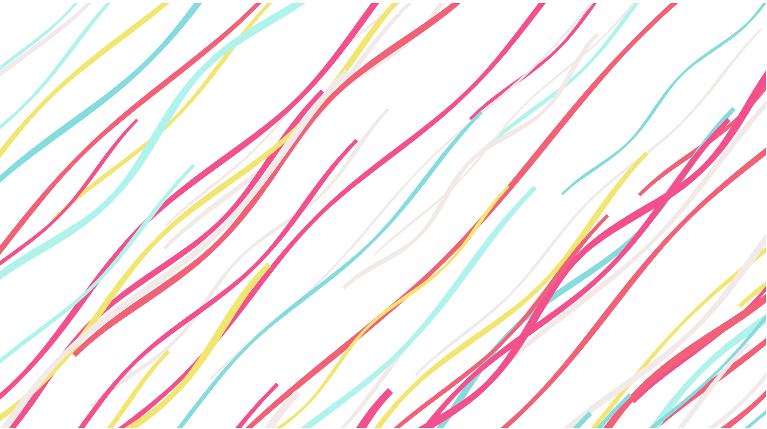
\15f6, \27d4, \141d
You can put different characters in the same grid. And if you're lucky, you would find several ranges of characters that fit together quite well.
\2500 - \257f
Transformation
By only looking at the visual aspects of the characters you'll notice that Unicode provides a rich source of new shapes and patterns, which most of them are hard to draw in CSS.
Sometimes with small transformations to the same character, you'll get slighly different shapes. Take the wave character '⌇' for example.
:after {
  content: '⌇';  /* or '\2307' */
  transform:
    rotateY(/* ... */)
    scaleX(/* ... */) scaleY(/* ... */);
}
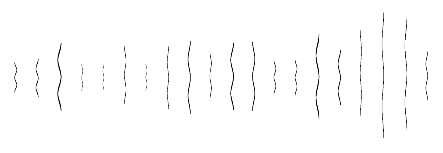
So let's try to make something with random transformation for each one. Here is the result.
\2307
Or to place them around a circle along with the transformations.
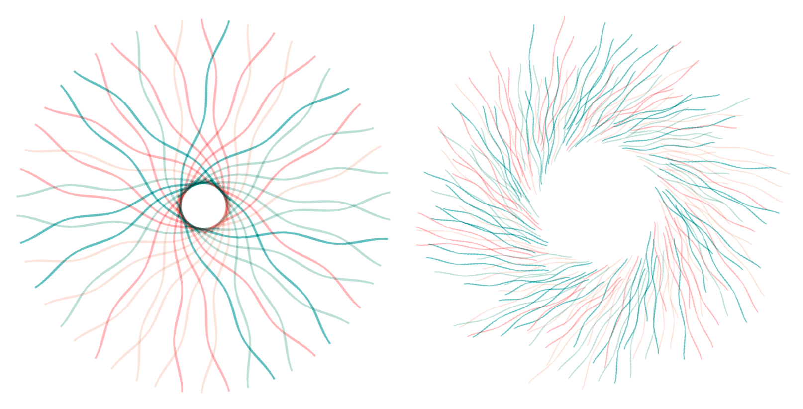
\2307
Note that in first graph above, part of the intersected curves formed by the shapes of the wave characters can be used as background as well.
\2307
Decoration
Comparing to the shapes hacked with HTML & CSS, one benefit of using Unicode characters is that
it's easy to add variations through properties like
font-family, font-weight etc.
And what's more, text masks.
.element:after {
  -webkit-background-clip: text;
  /* ... */
}
With text mask we can use linear-gradient, radial-gradient
and conic-gradient as background to decorate them.
As for linear-gradient and conic-gradient,
one trick here is to randomize its gradient angle to get different visual results.
:after {
  background: linear-gradient(
    <angle>, /* ... */
  );
}

:after {
  background: conic-gradient(
    from <angle>, /* ... */
  );
}
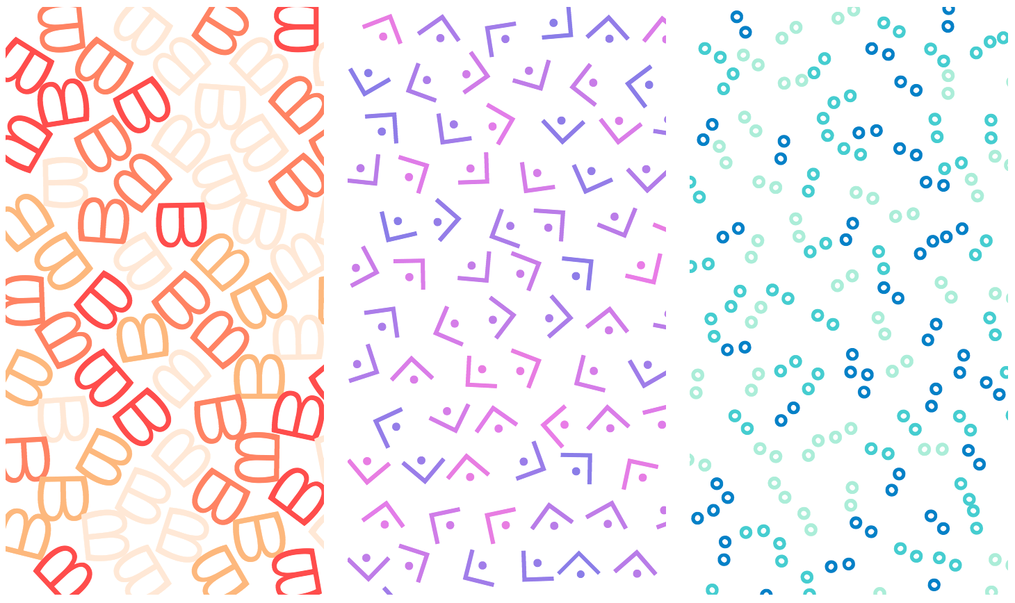
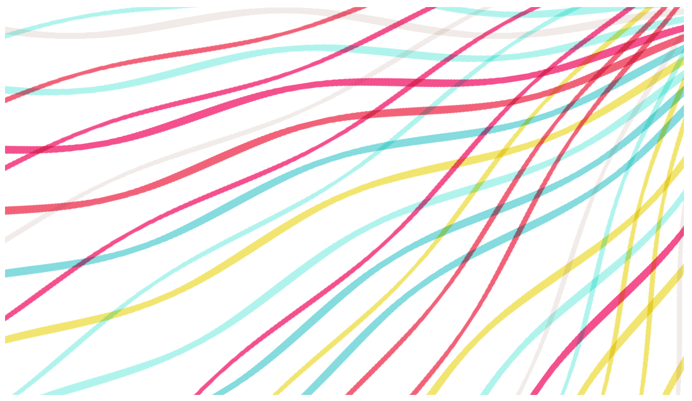
\1401 - \141b
The tool
The background patterns in this article are all generated with css-doodle. They could also be generated in plain JavaScript or any other programming languages though.
CSS has its limit but I really love the way it is and I'm sure there are more beautiful things to be discovered.
Updated:
(2018-05-17) I've created a collection for all the examples:
https://codepen.io/collection/DBWYVV/
(2018-06-02) There are more:
More Unicode Patterns
(2018-06-06) Note:
Some of the examples may look awful on different browsers/platforms.