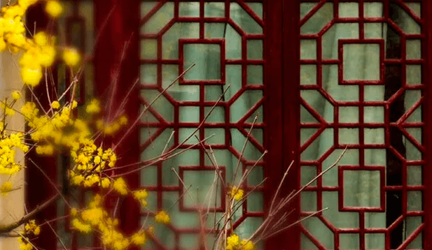
谁向云端着此亭,檐前树木映窗棂。
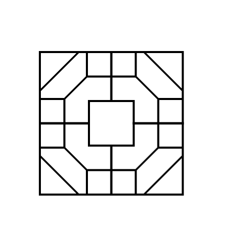
 (image from 中国窗棂)
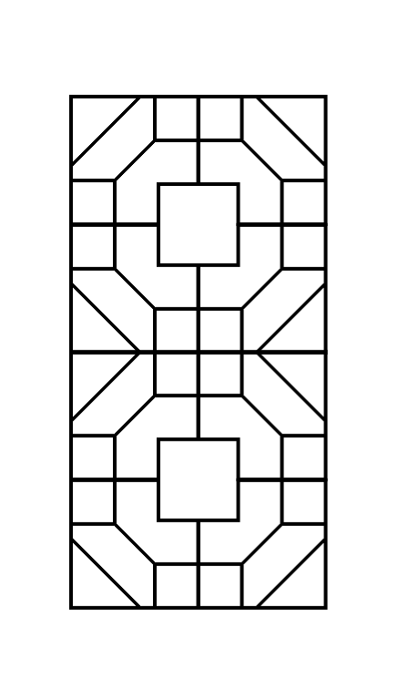
The traditional Chinese window lattice has a symmetrical beauty, as well as a very beautiful formal name -- 窗棂.
As a CSS lover, I've always wanted to draw them with CSS by hand.
But that's never being easy.
I thought using SVG might be much straightforward until I learned how to apply the
-webkit-box-reflect
property.
The property
Unfortunately, -webkit-box-reflect is non-standard. The standard way is to use
element() function, which has been implemented
in Firefox already.
Honestly the -webkit-box-reflect property seems much elegant to me because it has a better name and it doesn't rely on
an extra id like element() does. I don't get why it wasn't accepted by the CSS WG.
There's also an article in detail about reflection in CSS along with several demos by Ana Tudor back from 2016.
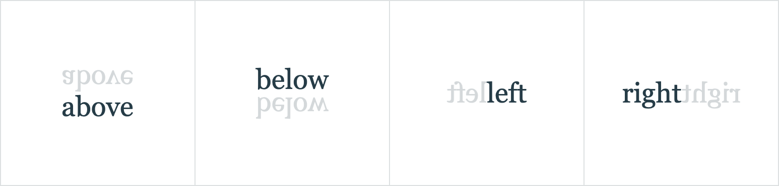
Directions
The -webkit-box-reflect property provides four directions of reflection:
above, below, left and right.
This is how to use it:
.box {
  -webkit-box-reflect: above|below|left|right;
}
Perhaps because it's just an experimental property from the very beginning, there's no way yet to add multiple reflections to an element at once.
I think it would be much cooler to have multiple reflections and reflections in various degrees other than only 4 of them.
It's still exciting
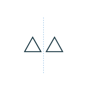
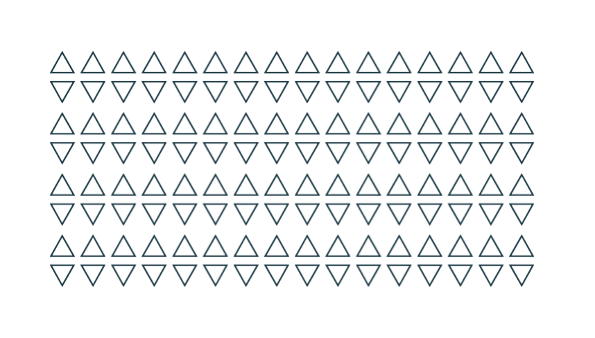
Let's start with a single div element and its reflection on the right side.
<div>△</div>

<style>
  div {
    -webkit-box-reflect: right;
  }
</div>
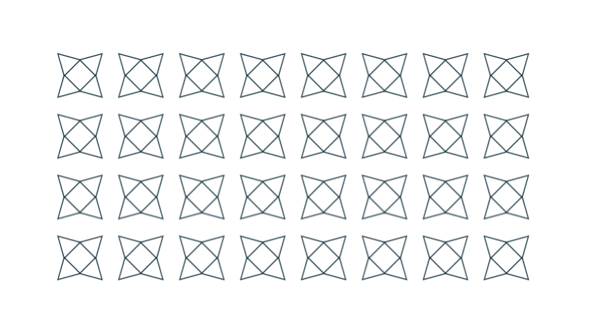
How to add another reflection?
Not long ago Chris Coyier introduced a trick in this
article,
about how to add shadows to a clipped element
by applying drop-shadow to its parent node.
Yes, we can do something similar by adding a parent node and setting reflection to it.
<div class="parent">
  <div class="box">△</div>
</div>

<style>
  .box {
    -webkit-box-reflect: right;
  }
  .parent {
    -webkit-box-reflect: below;
  }
</style>
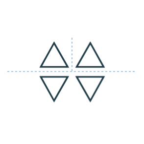
It's like unfolding a sheet of paper, first in half from left to right and then top to bottom. However, the order doesn't really matter.
Although it's not the exact result we wanted, it's so exciting to find a way to add multiple reflections.
Going deep
The total number of elements grows exponentially in this way,
which is dependent on the depth of the nested divs.
So given 2 nested divs like the above,
there will be 2^2 = 4 elements (including all the reflections).
Given 7 of them will be 2^7 = 128 elements.
Seed
The innermost div can be treated as a seed. Since
the whole graph composed with reflections will change with it.
For example, rotate it with -45 degree:
...
  <div>
    <div>
      <div class="seed">△</div>
    </div>
  </div>
...

<style>
  /* ... */
  .seed {
    /* ... */
    transform: rotate(-45deg);
  }
</style>
Or combine with any other properties and some old methods. It seems another different way to build Unicode Patterns as well.
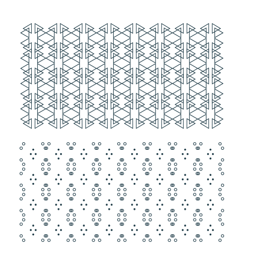
Chinese Window Lattice
So with the -webkit-box-reflect property and the technique described above,
we can finally draw those symmetrical window lattices in CSS with very few lines of code.
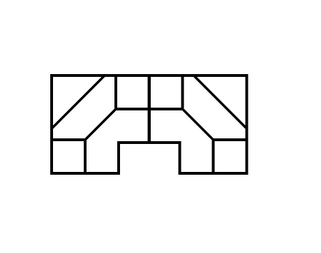
I want to take the picture at the beginning of the article as an example. Let's see how to draw them step by step.
1. The seed element
First, find out the smallest part that can't be divided any further. Here we start from the part in the upper left corner as the seed element.
And then draw these lines with background linear-gradient.
Using :empty selector to target the seed element for simplicity.
<div></div>

<style>
  div:empty {
    width: 72px; height: 72px;
    --g: linear-gradient(#000, #000);
    --gs: linear-gradient(-45deg,
      transparent calc(50% - 1px), #000 calc(50% - 1px),
      #000 calc(50% + 1px), transparent calc(50% + 1px)
    );
    background:
      var(--g) 0 0 / 100% 2px,       var(--g) 100% 0 / 2px 48px,
      var(--g) 100% 48px / 24px 2px, var(--g) 48px 100% / 2px 24px,
      var(--g) 0 100% / 48px 2px,    var(--g) 0 0 / 2px 100%,
      var(--g) 0 46px / 24px 2px,    var(--g) 24px 100% / 2px 26px,
      var(--g) 100% 24px / 26px 2px, var(--g) 46px 0 / 2px 24px,
      var(--gs) 50% 50% / 24px 24px, var(--gs) 0 0 / 40px 40px;
    background-repeat: no-repeat;
  }
</style>
2. Add reflection
The reflection begins with the seed element itself. We pick "right" as an initial direction and use custom property to make it more intuitive.
<div style="--reflect: right -3px"></div>

<style>
  div {
    -webkit-box-reflect: var(--reflect);
  }
  div:empty {
    /* ... */
  }
</style>
3. Continue unfolding
So we're going to add parent nodes for more reflections. It really helps to understand if you think of it as unfolding a sheet of paper.
<div style="--reflect: below -2px"></div>
  <div style="--reflect: right -3px"></div>
</div>
Add another one.
<div style="--reflect: below calc(200% - 6px)"></div>
  <div style="--reflect: below -2px"></div>
    <div style="--reflect: right -3px"></div>
  </div>
</div>
Repeat the process until we get the desired result.
<div style="--reflect: right calc(600% - 14px)">
  <div style="--reflect: right calc(200% - 6px)">
    <div style="--reflect: below calc(400% - 10px)">
      <div style="--reflect: below calc(200% - 6px)">
        <div style="--reflect: below -2px">
          <div style="--reflect: right -2px"></div>
        </div>
      </div>
    </div>
  </div>
</div>
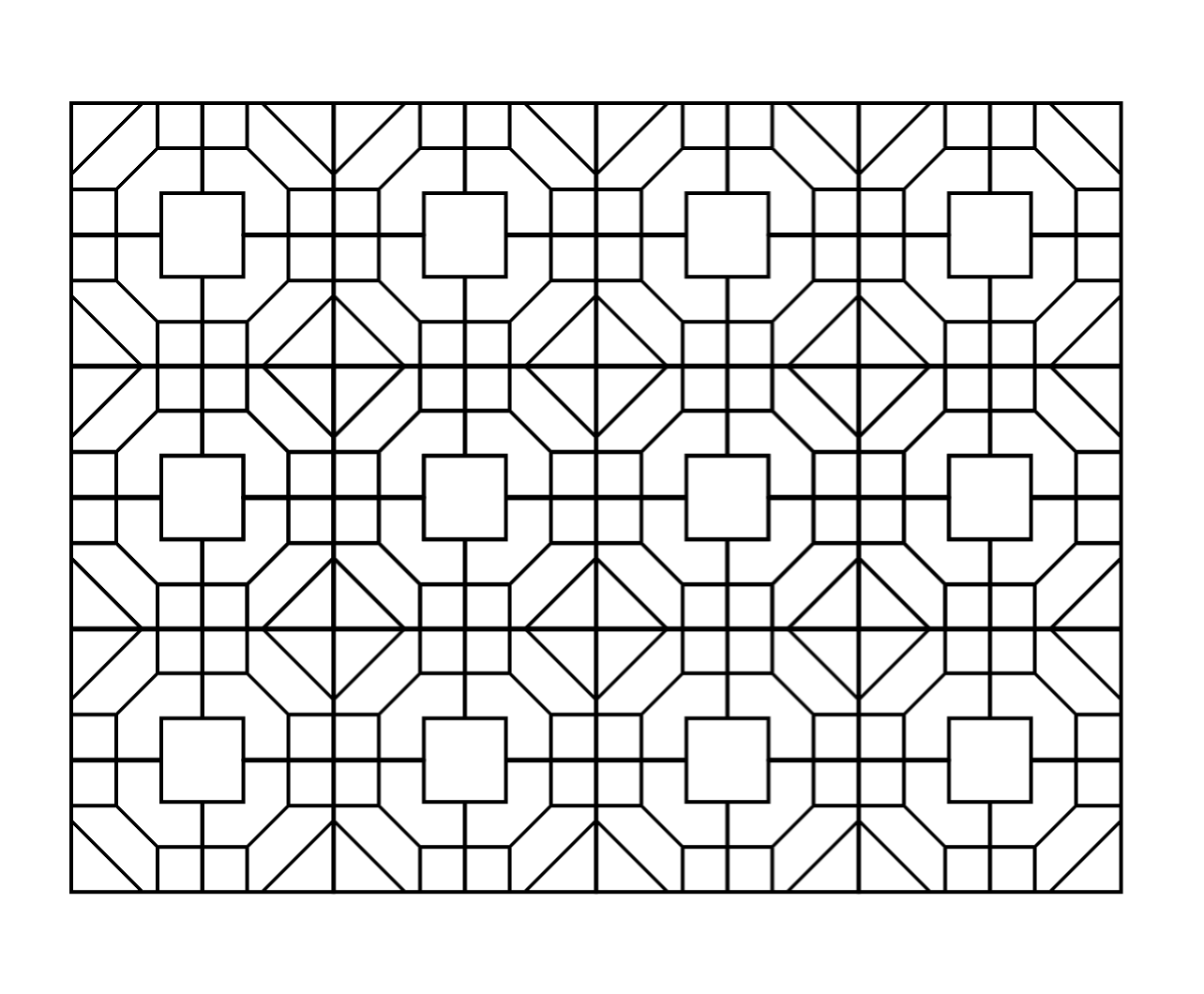
That's it.
You can see the result and the complete source code on CodePen. But you know it works only in Chrome and Safari.
Conclusion
The solution using -webkit-box-reflect property is beautiful in some way.
I really wish it had been accepted as a standard and can even do reflections in various directions. So that it may be
possible to do JianZhi (Chinese Paper-cutting Art) in CSS.